RESEARCH
Covid-19 INFOGRAPHICS
Faced with daunting economic consequences of the social distancing measures in place to mitigate the Covid-19 pandemic, governments around the world are announcing stimulus packages for their economies, amounting to unprecedented sizes.
This tracker aims to keep up to date with major announcements across a selected list of countries (which may be expanded over time), and compares the different stimulus packages to each other at a high level.
Updated: NOVEMBER 12, 2020
INFOGRAPHICS 10: Build Back Better Explained
As Malaysia ponders upon Budget 2021, we should think about “build back better” as the ultimate objective for the nation, as we strive to recover from the pandemic and weather the storm with a challenging economic outlook in the coming year.
CLICK HERE FOR INFOGRAPHICS.
INFOGRAPHICS 9: A New Economy Paradigm?
At REFSA, we see the government as a catalyst, using public investment in sectors critical to the future to precipitate private investment, and the resulting jobs and higher added value.
This series of graphics outline our reasoning regarding the fiscal space available to the government, and highlights focused measures designed to create good jobs, and at the same time orient the economy towards a higher added-value and greener future.
CLICK HERE FOR INFOGRAPHICS.
INFOGRAPHICS 8: Understanding the Budget and its process
With the announcement of Budget 2021 approaching, here are some tips about what is the Budget, what it entails and its process to get approved in Parliament. Materials are in Malay and Mandarin..
CLICK HERE FOR INFOGRAPHICS.
INFOGRAPHICS 7: What is the “Confidence and Supply Agreement”?
What exactly is a “Confidence and Supply Agreement”. Here, are some short explanations that will help you understand what does it entail, and what does it mean for the nation. Explanation in Malay and Mandarin.
CLICK HERE FOR INFOGRAPHICS.
INFOGRAPHICS 6: UPDATED ANNOUNCED GOVERNMENT STIMULUS IN % OF GDP, BY COUNTRY (AS AT 12 JUNE 2020)
Since the Economic Recovery Plan (PENJANA) announced on 5 June 2020, the Malaysian government has now revealed a total of approximately RM300 billion of stimulus measures to cushion the economic recession faced by the nation. But how does this compare to other nations like Singapore and the United Kingdom?
REFSA has updated its COVID-19 stimulus tracker to reflect what the latest numbers are. CLICK HERE FOR MORE INSIGHTS.
INFOGRAPHICS 5: UPDATED ANNOUNCED GOVERNMENT STIMULUS IN % OF GDP, BY COUNTRY (AS AT 6 APRIL 2020)
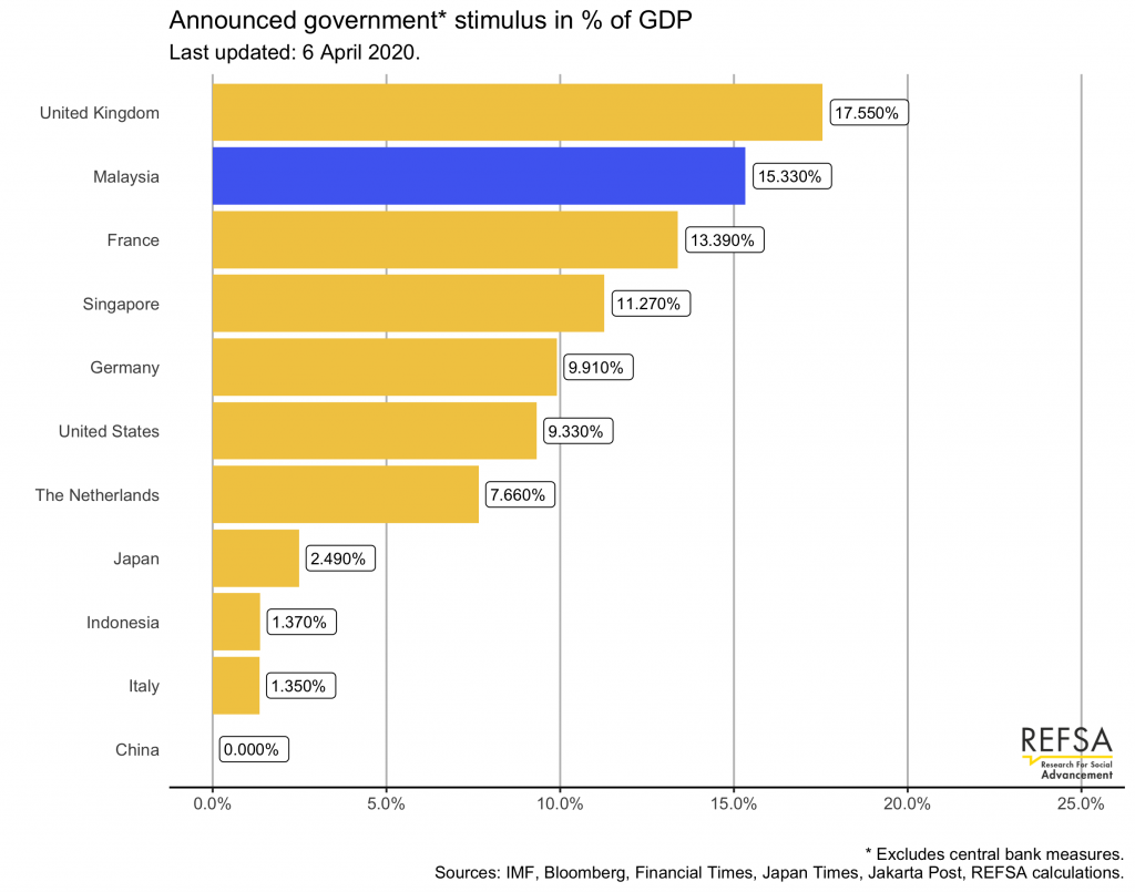
Chart A: Nominal GDP Chart showing total stimulus package announced by governments thus far.
The nominal amounts are taken directly from the government announcements or related news reports, and converted in USD in order to be able to compare. They do not attempt to “normalise” the different packages, so some of the amounts included here may not amount to the government taking on extra risk or extra liabilities.
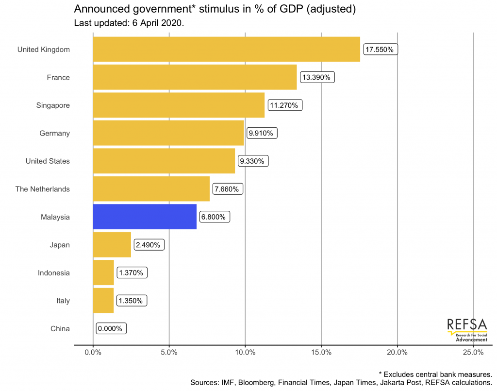
Chart B: Adjusted GDP Chart showing total fiscal measures within the stimulus package announced by governments thus far.
In order to try and gauge the effect of the stimulus packages on the economy, we attempt to normalise the packages across countries, by eliminating measures that do not form a liability (contingent or actual) for the government now or in the future.
Our reasoning is that a measure where the risk falls elsewhere than the government will not have as powerful an effect to stimulate the economy, due to agents’ expectations. For example, imposing a loan moratorium on banks without compensating the banks for the lost revenue may cause them to cut costs by reducing employment, which will exert downward pressure on the economy, due to the lost income.
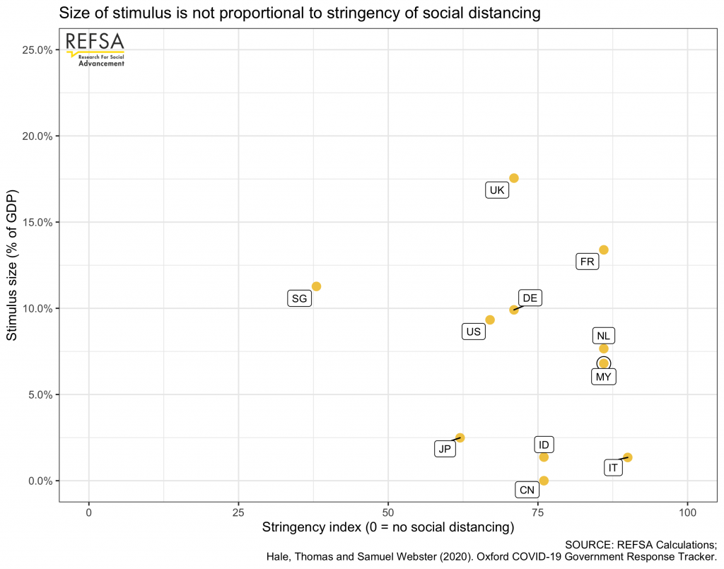
Chart C: Stimulus vs Stringency Plot Chart
Different countries have responded to the epidemic with different levels of social distancing. It stands to reason that the stricter the social distancing measures, the more the economy will suffer. Hence, stimulus packages should be greater in size in those countries with stricter measures.
The Blavatnik School of Government at Oxford University has launched a research project to measure the overall stringency of measures aimed at halting the spread of Covid-19. We combine the overall stringency index for the countries included in this analysis with the size of their overall stimulus package measured in percentage of GDP, in order to plot whether this relationship holds.
APR 7, 2020
On Monday, both Malaysia and Singapore announced further measures to stimulate their economies, in the wake of the Covid-19 pandemic and the far-reaching social distancing measures. We updated our stimulus trackers in response, presented with some notes below:
1) The additional RM 10bn the Malaysian government committed to support SME’s and micro-businesses is a welcome step and goes in the right direction. From Chart A it’s clear that, at face value, the Malaysian stimulus package is one of the largest. See Nominal GDP Chart.
2) However, when digging deeper, RM 100bn in the Malaysian package is borne by the banks, and RM 40bn is the rakyat’s money (EPF savings), so these have a smaller stimulus effect. Adjusting the numbers to take this into account, the relative size of the package changes significantly. See Chart B: Adjusted GDP Chart.
3) On the other hand, the extra SGD 5bn Singapore announced is all cash injected by the government. Singapore’s stimulus package is almost two thirds new cash, whereas Malaysia’s is only about a third.
4) In addition, we should also consider the strictness of the social distancing measures. The stricter, the greater the impact on the economy. Researchers at the Blavatnik School designed a “stringency index” to measure the strictness.
5) Mapping this stringency index on the stimulus sizes (in % of GDP) yields Chart C: Stimulus vs Stringency plot chart. Countries with stricter social distancing are further to the right, bigger stimulus packages are higher on the chart.
6) The plot chart does not yet include the stricter measures announced last week in Singapore, but the bulk of the stimulus was announced in February, so it confirms the outlier nature of Singapore’s stimulus.
7) On the other hand, Malaysia’s adjusted package ranks quite low compared to countries with similarly strict measures. Therefore we repeat our call for gov’t to increase the support to businesses further, from SME’s to self-employed. Better to do too much than too little at this point.
INFOGRAPHICS 4: ANNOUNCED FISCAL STIMULUS IN % OF GDP, BY COUNTRY (AS AT 27 MARCH 2020)
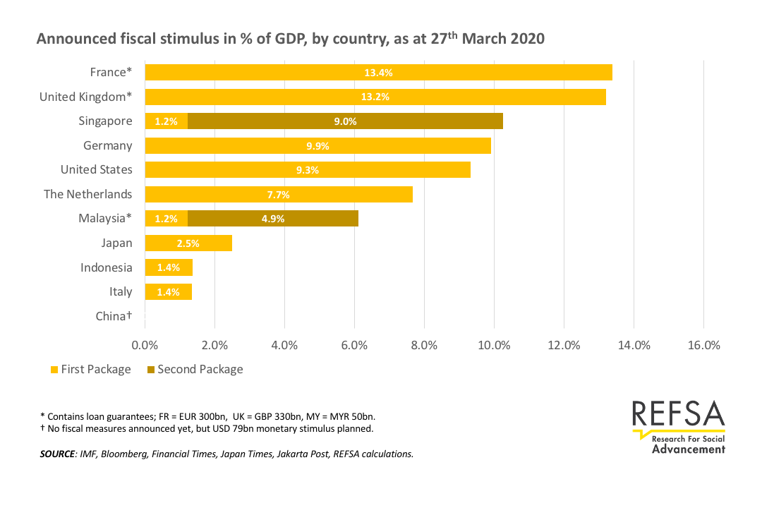
MAC 28, 2020
The largest component is the loan moratorium, which seemingly will end up being financed by BNM, and thus not included here. The RM40bn withdrawal from EPF is the contributors’ own money and hence not a fiscal stimulus either.
We included the RM50bn Danajamin allocation, since the government will eventually bear the risk on these guarantees, similar to France and the UK, for example.
Even with this relatively small pure fiscal stimulus, the public debt level will breach the symbolic 55% ceiling,so fiscal prudence is jeopardised anyway in the eyes of sovereign rating agencies, for what it’s worth.
Given the exceptional context, we still advocate for markedly higher fiscal stimulus of approx RM75bn, and increase in government loan guarantees to RM75bn, for a total of RM150bn or 10% of GDP. This would result in a package comparable to those seen in other economies.
INFOGRAPHCIS 3: ANNOUNCED FISCAL STIMULUS IN % OF GDP, BY COUNTRY (AS AT 23 MARCH 2020)
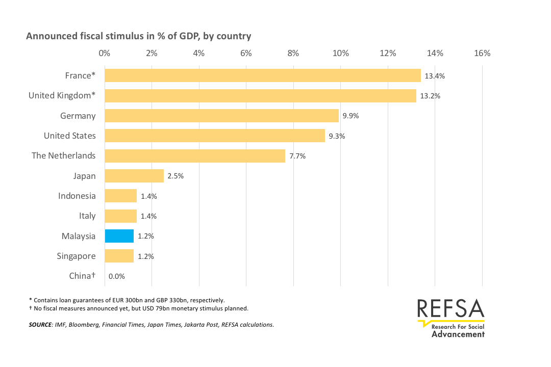
MAC 24, 2020
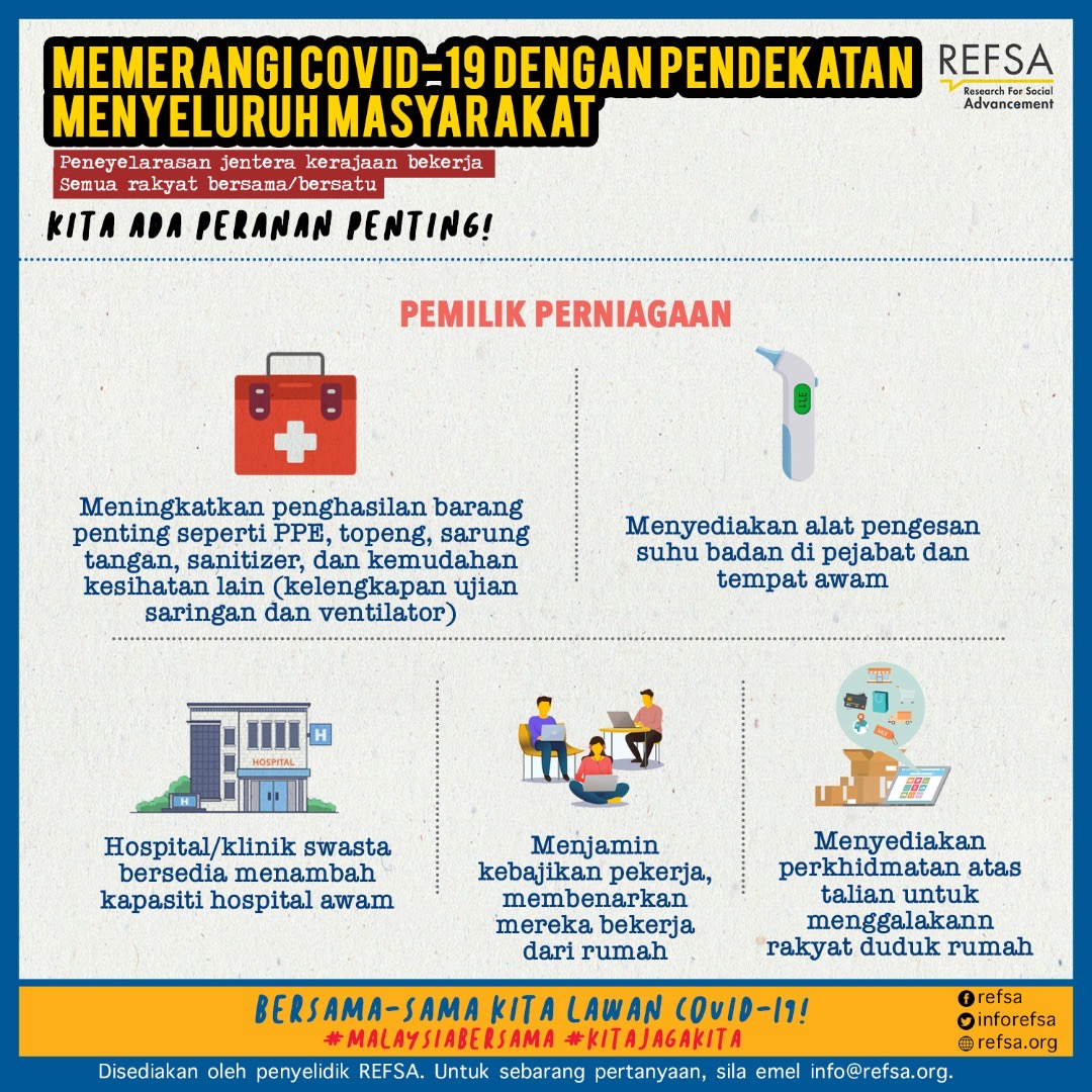
INFOGRAPHICS 2: COMBAT COVID-19 THROUGH A WHOLE-OF-SOCIETY APPROACH
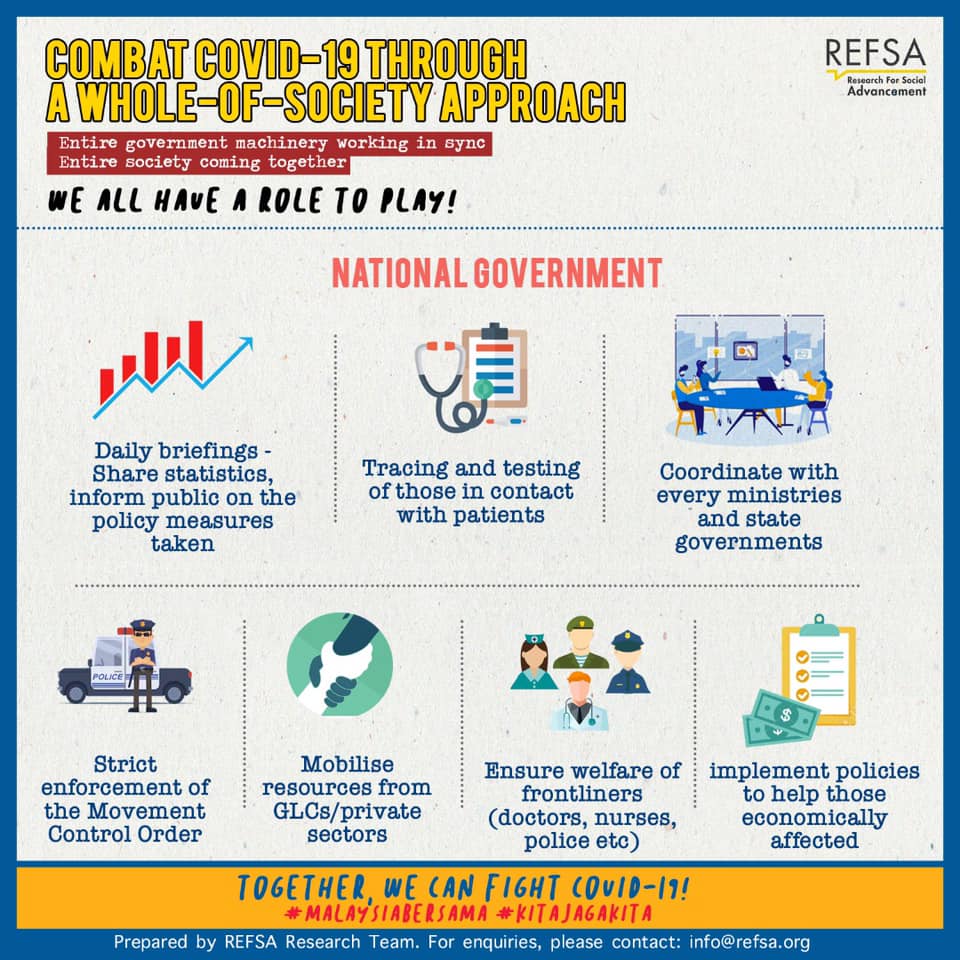


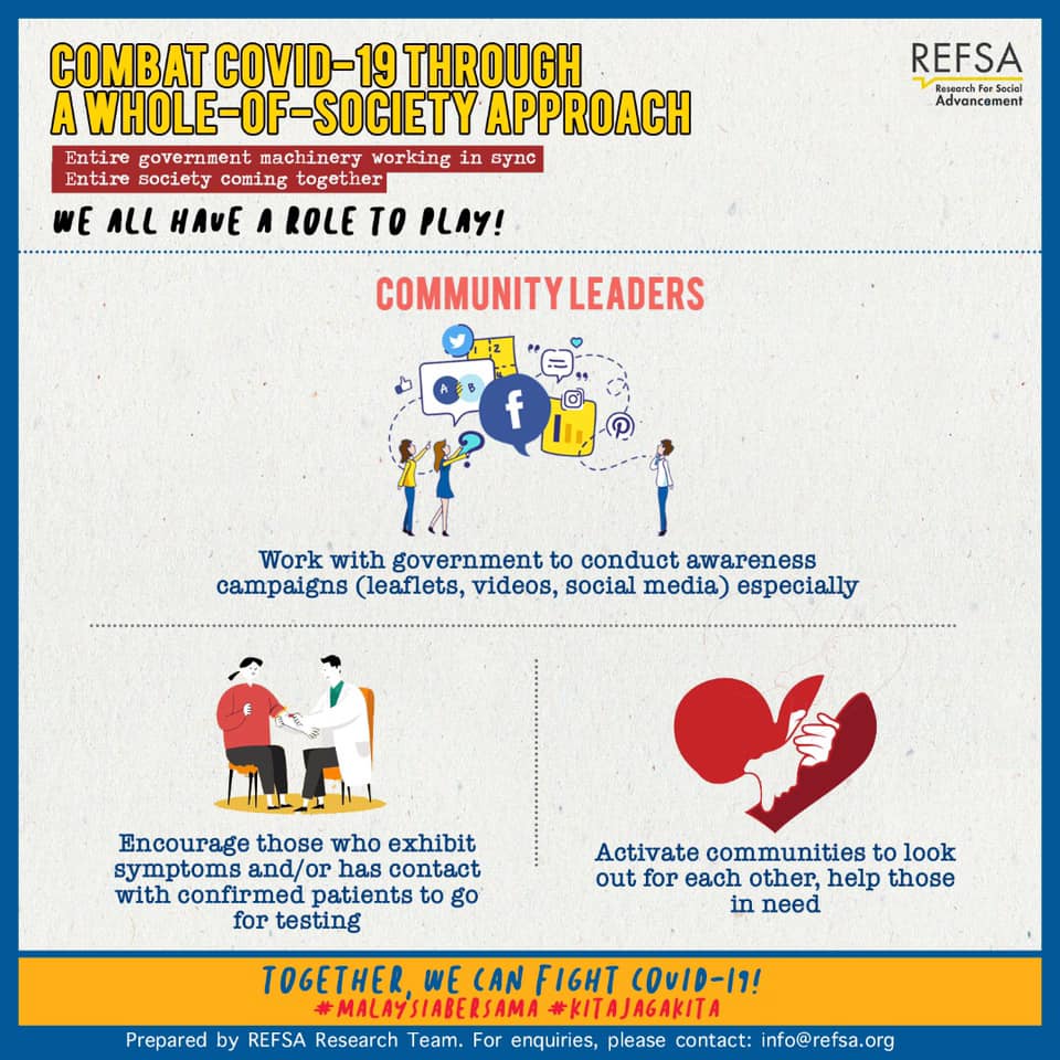
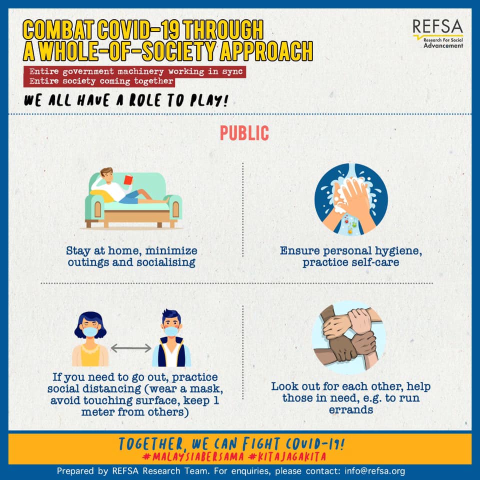
MAC 21, 2020
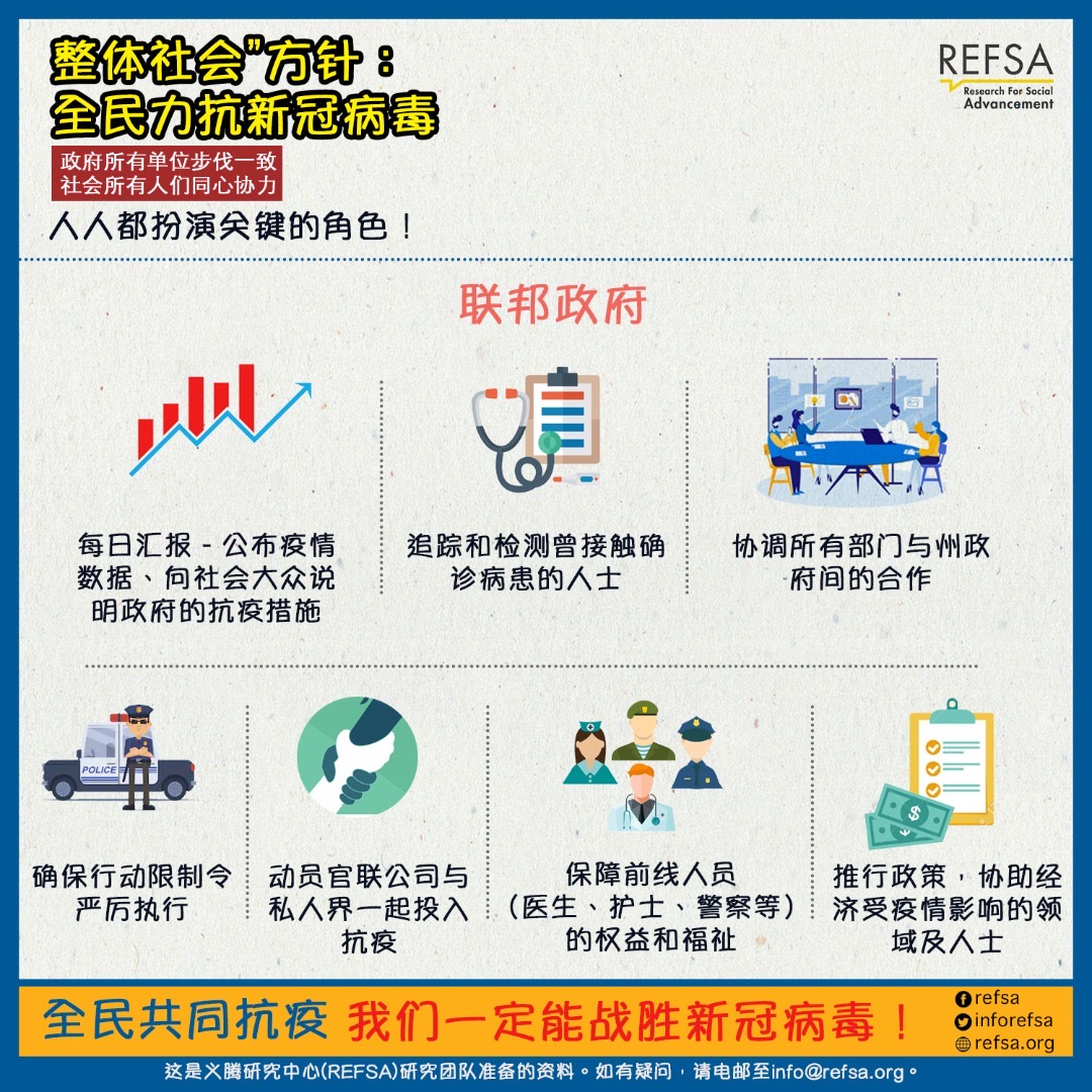
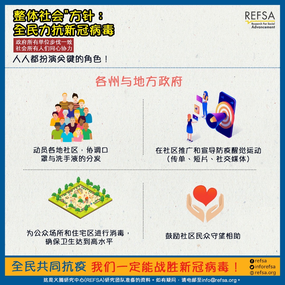
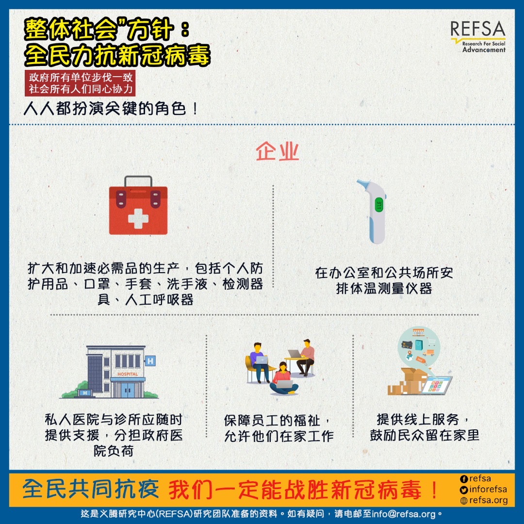
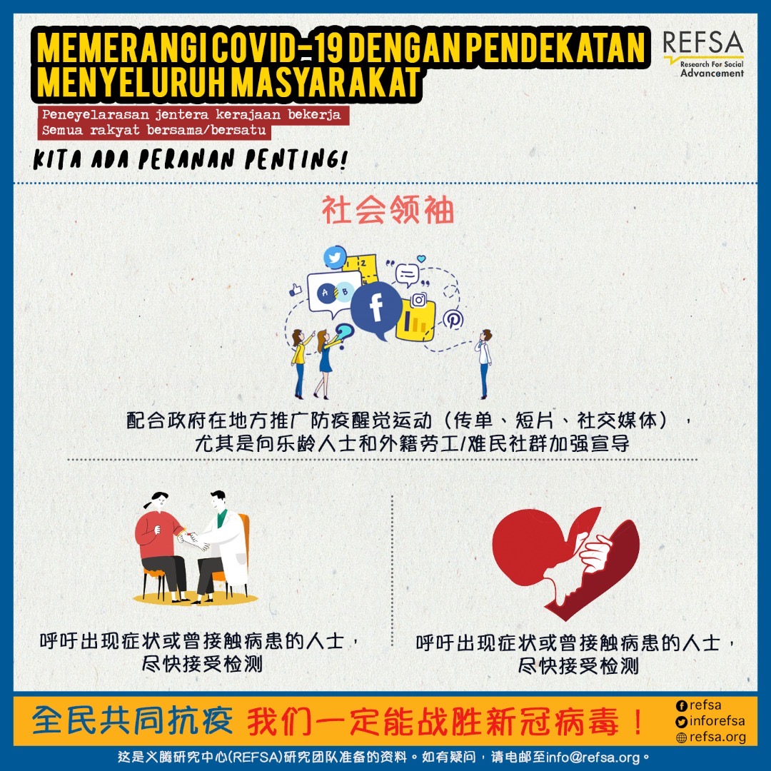
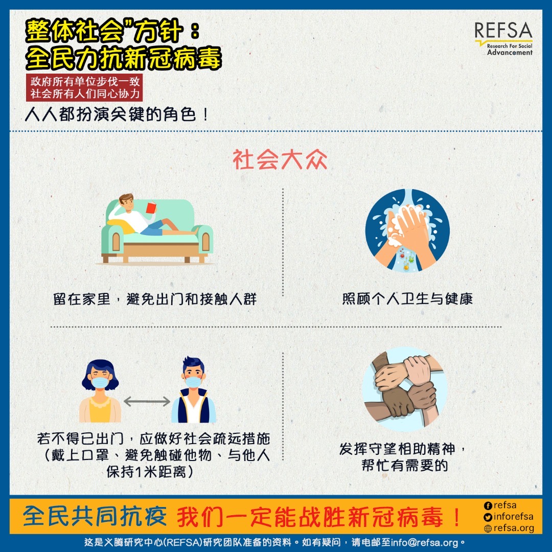
抗新冠病毒,人人都扮演关键角色。让我们实行“整体社会“方针,同心协力,共同抗疫。
确保自身安全,接收正确资讯。


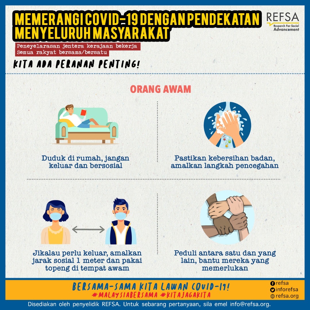
Untuk melawan Covid-19. kita perlu menurunkan lengkuk. Sama-sama kita memainkan peranan bersama.
Kekal Selamat, Sentiasa Dimaklumkan
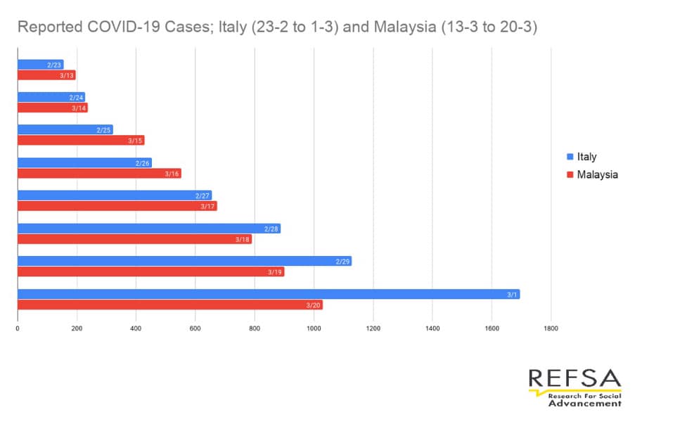
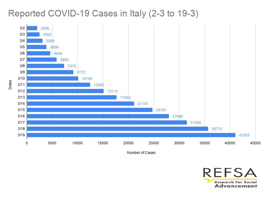
Infographics 1: NUMBER OF COVID-19 CASES IN MALAYSIA AND ITALY
MAC 20, 2020